

#CreativeWriting
The Best Marketing Strategies for New Fiction Authors: A Practical Guide to Building an Audience From Zero
The Best Marketing Strategies for New Fiction Authors: A Practical Guide to Building an Audience From Zero
Chuck Morgan, Crime Fiction Author
Most new fiction authors believe the hardest part of the journey is writing the book. Then they hit “publish” and discover the real challenge: getting readers to notice it. The truth is simple but uncomfortable, great books don’t sell themselves. Readers don’t magically appear. Visibility isn’t luck. It’s strategy, consistency, and understanding how readers discover new stories.
The good news is that fiction authors don’t need a huge budget, a massive following, or a marketing degree to build momentum. What they do need is a clear plan, a willingness to experiment, and a focus on long-term audience building rather than quick wins.
This guide breaks down the most effective, sustainable marketing strategies for new fiction authors. The ones that move books, build readership, and create a foundation for a long career.
1. Start With the Core: Know Your Genre and Your Reader
Marketing begins long before you post on social media or run an ad. It starts with understanding who your book is for.
Readers don’t buy genres, they buy experiences. They buy the feeling your story promises.
Ask yourself:
- What emotional experience does my book deliver?
- What tropes does it use?
- What books is it similar to?
- Who is the ideal reader — age, interests, reading habits?
- What problem does my book solve for them (escape, thrill, comfort, catharsis)?
When you know your reader, everything becomes easier: your cover, blurb, keywords, social content, newsletter tone, and even your long-term brand.
If you skip this step, every other marketing effort becomes guesswork.
2. Build an Author Brand That Signals Your Genre Instantly
Readers make snap decisions. They judge your professionalism, genre, and tone in seconds. Your brand should communicate:
- What you write
- Who it’s for
- What emotional promise do you deliver
For fiction authors, brand is not a logo; it’s consistency across:
- Book covers
- Website
- Social media tone
- Email voice
- Author photo
- Tagline
- Series naming conventions
A thriller author should feel different from a cozy mystery author. A fantasy author should feel different from a romance author.
Branding is not about being fancy; it’s about being recognizable.
3. Create an Email List Early — It’s Your Most Valuable Asset
Social media platforms change. Algorithms shift. Ads get expensive. But your email list is yours forever.
For fiction authors, an email list is the single most reliable way to:
- Launch books
- Build long-term readership
- Get reviews
- Sell backlist titles
- Announce promotions
- Create superfans
How to grow your list from scratch
- Offer a reader magnet. A short story, prequel, bonus epilogue, or character dossier works beautifully. It doesn’t need to be long, but it needs to be irresistible.
- Use a simple landing page. Tools like MailerLite or ConvertKit make this easy.
- Promote it everywhere.
- Back of your book
- Social media
- Website
- Author bio
- Guest posts
- Newsletter swaps
- Email consistently. Once a week or twice a month is enough. Share behind‑the‑scenes content, character insights, early cover reveals, and personal notes that build connection.
Your list becomes your launch team, your review team, and your most loyal fan base.
4. Optimize Your Amazon Presence. It’s Your Primary Storefront
Most fiction sales happen on Amazon, especially for new authors. That means your Amazon page must do the heavy lifting.
Key elements to optimize
- Cover — must match genre expectations instantly
- Title + subtitle — clear, interesting, keyword‑rich
- Book description — scannable, emotional, structured for conversion
- Categories — choose niche categories to increase visibility
- Keywords — use long‑tail phrases readers actually search
- A+ Content — free visual real estate that boosts conversions
- Author page — professional photo, bio, links, and updates
Amazon’s algorithm rewards books that convert well. A polished page increases conversion, which increases visibility, which increases sales; a self-reinforcing loop.
5. Use Social Media Strategically (Not Constantly)
You don’t need to be everywhere. You don’t need to post daily. You don’t need to dance on TikTok unless you want to.
What you need is a platform where you can:
- Show your personality
- Share your writing journey
- Connect with readers
- Network with other authors
- Promote your email list
Best platforms for fiction authors
- TikTok (BookTok) — explosive reach for fiction
- Instagram — visual storytelling, reels, aesthetic branding
- Facebook — groups, older readers, community building
- Threads — low-pressure, conversational
- YouTube Shorts — fast growth, evergreen content
What to post
- Tropes in your book
- Character teasers
- “If you like X, you’ll love this.”
- Behind-the-scenes writing moments
- Aesthetic mood boards
- Quotes from your book
- Personal stories that build connections
Social media is not about selling; it’s about attracting.
6. Leverage Communities Where Readers Already Gather
Instead of shouting into the void, go where readers already hang out.
High‑value communities
- Goodreads groups
- Reddit subreddits (genre‑specific)
- Facebook reader groups
- Discord servers
- Book clubs
- Local libraries
- Local writing groups
Take part as a human, not a marketer. Build relationships. Offer value. When you mention your book, it feels natural, and people respond.
7. Use Newsletter Swaps and Group Promos to Grow Fast
This is one of the most powerful growth strategies for new fiction authors, and it’s free.
Newsletter swaps
You promote another author’s book to your list, and they promote yours to theirs. The key is swapping with authors in your exact genre.
Group promos
Platforms like BookFunnel and StoryOrigin let you join themed promotions:
- “Thrillers with strong female leads.”
- “Cozy mysteries under 300 pages.”
- “Dark fantasy with antiheroes.”
Readers sign up for your magnet, and your list grows quickly with targeted fans.
8. Get Reviews Early and Consistently
Reviews are social proof. They influence Amazon ranking, conversions, and visibility.
How to get early reviews ethically
- ARC team (even 10–20 readers helps)
- Newsletter subscribers
- Beta readers
- BookFunnel ARC programs
- Reedsy Discovery
- Goodreads giveaways
- Back‑of‑book call‑to‑action
Never pay for reviews. Never trade reviews. Never pressure readers. Just make it easy and rewarding for them to support you.
9. Use Content Marketing to Build Long‑Term Discoverability
Content marketing is slow but powerful. It builds authority, SEO, and reader trust.
Effective content types for fiction authors
- Blog posts about your genre
- Behind-the-scenes world building articles
- Character interviews
- Writing journey updates
- Short stories
- YouTube videos
- Podcast guest appearances
This content attracts readers who love your world, your voice, and your storytelling style.
10. Build Relationships With Other Authors — It’s a Force Multiplier
The indie author world is collaborative, not competitive. Authors who network grow faster.
Ways to collaborate
- Co‑host giveaways
- Swap newsletters
- Share each other’s posts
- Co‑write short stories
- Appear on each other’s podcasts
- Bundle books
- Cross‑promote launches
A rising tide lifts all boats, especially in fiction.
11. Plan Launches Like Events, Not Afterthoughts
A strong launch sets the tone for your book’s entire lifespan.
A simple but effective launch plan
- 60 days out: cover reveal
- 45 days out: ARC team
- 30 days out: preorders
- 14 days out: teaser content
- Launch week: daily posts + email sequence
- Post‑launch: reviews push + newsletter swaps
Consistency beats intensity. A steady drumbeat works better than a single loud blast.
12. Think Long‑Term: Series Sell Better Than Standalones
If you want a career, not a one‑off success, write in series.
Series create:
- Repeat buyers
- Higher read‑through
- Stronger branding
- Easier marketing
- More predictable income
A reader who loves Book 1 will buy Book 2, 3, 4, and beyond. A standalone must win a new reader every time.
Final Thoughts: Marketing Is a Skill, Not a Mystery
New fiction authors often feel overwhelmed by marketing because it seems unpredictable. But once you understand how readers discover books — and how platforms reward engagement — the path becomes clear.
The most successful authors aren’t the loudest or the luckiest. They’re the ones who:
- Know their audience
- Build an email list
- Show up consistently
- Optimize their storefront
- Connect with readers
- Collaborate with other authors
- Treat their writing like a long‑term business
You don’t need to do everything. You just need to do the right things consistently.
Email Marketing and Building an Email List for New Authors: A Complete Guide
Email Marketing and Building an Email List for New Authors: A Complete Guide
Chuck Morgan, Crime Fiction Author
If you’re a new author, you’ve probably heard the advice: “Start an email list.” It’s repeated so often that it can feel like a cliché, but it’s also the most consistently accurate marketing truth in publishing. Social media trends shift, algorithms change, and retailers control visibility, but your email list is the one platform you truly own. It follows you from your first book to your twentieth, giving you a direct line to the readers most likely to buy, review, and champion your work.
This article breaks down why email marketing is essential, how to build your list from zero, and how to use it effectively without feeling overwhelmed.
Why Email Marketing Matters More Than Anything Else
Email marketing is the backbone of a sustainable author career for one simple reason: it gives you control. Unlike social media platforms, where your reach can disappear overnight, your email list is stable, predictable, and yours.
According to industry data, authors with strong email lists dramatically outperform those without them. Email consistently delivers higher engagement than any other channel because subscribers choose to hear from you. They’re invested. They’re curious. They’re primed to become fans.
For new authors, this is especially important. You may not have a large social following or a big advertising budget, but you can build a list of readers who care about your stories and want to follow your journey.
Step 1: Choose the Right Email Service Provider
Before you can build a list, you need a platform to host it. Fortunately, there are several beginner‑friendly options designed with authors in mind.
Popular choices include:
- MailerLite – clean interface, generous free tier, excellent automation tools.
- ConvertKit (Kit) – strong for creators, great for sequences and landing pages.
- Flodesk – beautiful templates and simple pricing.
- Substack – ideal if you want a newsletter‑first platform with built‑in discovery.
For most new authors, MailerLite is the easiest and most cost‑effective place to start. It offers free plans for small lists and intuitive tools for creating landing pages, automations, and newsletters.
Step 2: Create a Simple Author Website or Landing Page
You don’t need a full website to build your list. A single landing page, hosted by your email provider, is enough. This page should include:
- A clear headline (Get a Free Story + Exclusive Updates)
- A short description of what the reader will receive
- A signup form
- An interesting image (your book cover or author photo)
As you grow, you can expand into a full website, but don’t let perfection slow you down. A clean signup page is all you need to begin.
Step 3: Offer a Reader Magnet
A reader magnet is a free piece of content you give readers for joining your list. It’s the single most effective way to grow your audience quickly.
Great reader magnets include:
- A free novella or short story
- A prequel to your series
- The first few chapters of your upcoming book
- A bonus epilogue or alternate POV scene
- A world guide, map, or character dossier (for fantasy/sci‑fi)
Your magnet doesn’t need to be long; it just needs to be good and relevant to what you write. The goal is to give readers a taste of your storytelling so they want more.
Step 4: Use Multiple Touchpoints to Collect Emails
Once you have your magnet and landing page, you need to put them where readers will see them. Effective places include:
1. Back Matter of Your Books
This is the highest‑converting location. Add a link at the end of your book that says:
“Enjoyed this story? Get a free bonus chapter and future updates here.”
Readers who finish your book are your warmest leads.
2. Social Media Profiles
Pin your signup link to the top of your Facebook page, Instagram bio, TikTok profile, or X account.
3. Your Website
Place your signup form on your homepage, sidebar, and footer.
4. Giveaways and Promotions
Take part in genre‑specific giveaways through sites like Book Funnel or StoryOrigin. These can help you grow quickly; just be sure to clean your list afterward to remove freebie‑seekers who never engage.
5. In‑Person Events
If you attend signings, conferences, or book fairs, offer a QR code that links to your signup page.
Step 5: Send a Warm Welcome Sequence
Once someone joins your list, don’t leave them hanging. A welcome sequence is a short series of automated emails that introduces readers to you and your work.
A simple 3–5 email sequence might include:
- Delivery of the reader magnet
- A personal introduction—why you write, what you love
- A behind‑the‑scenes look at your book or series
- A soft pitch for your other books
- An invitation to connect on social media or reply to your email
This sequence builds trust and turns casual subscribers into fans.
Step 6: Email Consistently (But Not Constantly)
You don’t need to email every week. You do need to email regularly enough that readers remember who you are.
A good rhythm for new authors is:
- Once a month during quiet periods
- Once a week during a book launch
- Every 2–3 weeks during active writing or promotions
Your emails should be a mix of:
- Updates on your writing
- Behind‑the‑scenes insights
- Personal stories
- Book recommendations
- Exclusive content
- Launch announcements
- Sales and promotions
The key is to be authentic and consistent. Readers want to feel connected to you, not marketed to.
Step 7: Keep Your List Healthy
A strong list isn’t just about size; it’s about engagement. Clean your list every few months by removing subscribers who haven’t opened or clicked in a long time. This improves deliverability and ensures your emails reach the people who care.
Final Thoughts
Email marketing isn’t complicated; it’s strategic. Start with a simple landing page, offer an interesting reader magnet, and show up consistently with value. Over time, your list becomes your most powerful asset: a community of readers who support every book you write.
If you’re a new author, there’s no better time to start than today. Your future fans are waiting.
Social Media Posts vs. Paid Social Media Advertising: A Guide for New Writers
Social Media Posts vs. Paid Social Media Advertising: A Guide for New Writers
Chuck Morgan, Crime Fiction Author
Social media has become one of the most powerful tools for authors — whether you’re launching your first book, building an audience, or trying to grow your brand. But not all social media activity works the same way. As a new writer, you’ll hear two terms over and over: organic social media posts and paid social media advertising.
Both can help you grow. Both can sell books. Both can build your author brand. But they work differently.
This article breaks down the pros, cons, differences, and best uses of each so you can make smart decisions about your author platform, even if you’re starting with zero budget.
1. What Organic Social Media Posts Actually Are
Organic posts are the everyday content you share for free: updates, behind‑the‑scenes writing moments, quotes, videos, character art, book announcements, and conversations with readers. They appear in your followers’ feeds and sometimes reach new people through shares, hashtags, or platform algorithms.
Benefits of Organic Posting
· Builds genuine relationships. Organic content is about connection, not selling. Readers follow authors they feel close to.
· Free and sustainable. You can post daily without spending a dollar.
· Strengthens your brand's voice. Readers learn who you are, what you write, and why they should care.
· Encourages engagement. Comments, shares, and conversations help your visibility.
· Great for long‑term growth. Organic content compounds.
Drawbacks of Organic Posting
· Limited reach. Only a percentage of your followers see each post. Algorithms decide the rest.
· Slow growth. It can take months or years to build momentum.
· Not ideal for launches alone. If you rely only on organic posts, your book release may not reach enough people.
· Requires consistency. You need to show up regularly to stay visible.
2. What Paid Social Media Advertising Is
Paid social media advertising includes boosted posts, sponsored posts, and full ad campaigns on platforms like Facebook, Instagram, TikTok, and X. These ads reach people beyond your followers — often people who have never heard of you.
Benefits of Paid Advertising
· Massive reach. Paid ads can reach thousands of targeted readers instantly.
· Precise targeting. You can target readers by genre interests, age, location, behavior, and more.
· Fast results. Great for book launches, promotions, and list‑building.
· Scalable. Spend more → reach more.
· Customizable creative. Paid ads allow strong visuals, calls‑to‑action, and optimized messaging.
Drawbacks of Paid Advertising
· Costs money. Even small campaigns add up.
· Requires strategy. Poor targeting wastes money quickly.
· Learning curve. Ads require testing, tweaking, and analyzing.
· Not all ads convert. Even good ads can fail if the audience isn’t right.
3. Key Differences Between Organic Posts and Paid Ads
Purpose
Organic: Build relationships, community, and trust.
Paid: Drive reach, clicks, sales, and measurable actions.
Audience
Organic: Mostly your existing followers.
Paid: Anyone you choose to target — even people who’ve never heard of you.
Speed
Organic: Slow and steady.
Paid: Fast and scalable.
Cost
Organic: Free.
Paid: Budget required.
Control
Organic: Algorithm decides who sees your posts.
Paid: You control targeting, placement, and reach.
4. When New Writers Should Use Organic Posting
Organic posting is essential for:
Building your author identity
Readers want to know the person behind the book. Organic content lets you show your personality, process, and passion.
Developing a loyal community
Readers who feel connected to you become superfans, the ones who buy every book, leave reviews, and share your work.
Sharing your writing journey
Draft updates, character sketches, writing struggles, and victories all help readers feel invested.
Growing slowly but authentically
Organic posting is the foundation of your long‑term author brand.
5. When New Writers Should Use Paid Advertising
Paid ads are ideal for moments when you need reach, speed, and precision.
Book launches
Ads can introduce your book to thousands of genre‑specific readers instantly.
Building your email list
Paid ads can drive signups for a free novella, sample chapters, or reader magnet.
Boosting a high‑performing post
If an organic post is already doing well, boosting it can multiply its reach.
Running sales or promotions
Limited‑time discounts perform extremely well with paid ads.
6. Pros and Cons Summary Table
Feature Organic Posts Paid Ads
Cost Free Requires budget
Reach Limited to followers + shares Broad, targeted, scalable
Speed Slow Fast
Best For Community, trust, brand building Launches, sales, list‑building
Control Algorithm‑dependent Full targeting control
Longevity Long‑term growth Short‑term impact
Skill Needed Low Medium–high
7. Should New Writers Use Both?
Yes — and here’s why.
According to industry analysis, the strongest strategies combine organic and paid social media, using each for what it does best. Organic builds trust and steady growth; paid provides reach and results when you need them.
For new writers, this hybrid approach is ideal:
· Use organic content to build your voice, community, and authenticity.
· Use paid ads strategically during launches, promotions, or list‑building pushes.
You don’t need a huge budget. Even $5–$10 boosts can help.
8. A Simple Strategy for New Writers
Step 1: Post organically 3–5 times per week
Share:
· Writing updates
· Quotes
· Behind‑the‑scenes
· Reader questions
· Short videos
· Excerpts
Step 2: Watch what performs well
If a post gets strong engagement, save it. It might be a good candidate for boosting later.
Step 3: Boost only your best content
Boosting a high‑performing post is the easiest, safest way to start with paid ads.
Step 4: Run small, targeted campaigns for launches
Target readers who love your genre. Start small, test, and scale what works.
Final Thoughts
Organic posting and paid advertising are not competitors — they’re partners. Organic content builds your foundation; paid ads amplify your reach. As a new writer, you don’t need to master everything at once. Start with organic posting, learn your audience, and add paid ads when you’re ready.
Hiring an Editor vs. Using Online Editing Tools: What New Authors Need to Know
Hiring an Editor vs. Using Online Editing Tools: What New Authors Need to Know
Chuck Morgan, Crime Fiction Author
For new authors, few decisions feel as intimidating, or as important, as choosing how to edit your manuscript. You’ve poured months or years into writing your book. Now you’re staring at a draft that needs polishing, tightening, correcting, and elevating before it’s ready for readers. The question becomes: Do you hire a professional editor, or do you rely on the growing number of online editing tools available today?
Both paths can lead to a strong finished book, but they offer very different experiences, costs, and outcomes. Understanding the strengths and limitations of each option will help you make the right choice for your goals, your budget, and your writing style.
Why Editing Matters More Than You Think
Before diving into the comparison, it’s worth emphasizing why editing is non‑negotiable. Readers today have endless choices. A single typo on page one, a confusing plot point, or clunky dialogue can cause them to close your book and move on. Worse, negative reviews can follow you for years.
Editing isn’t just about fixing mistakes. It’s about:
· Strengthening your storytelling
· Clarifying your voice
· Improving pacing and flow
· Ensuring consistence
· Enhancing reader immersion
Whether you hire a human or use software, the goal is the same: to produce a book that feels professional, polished, and worth reading.
The Case for Hiring a Professional Editor
Professional editors have been the backbone of publishing for centuries. Even bestselling authors rely on them. For new authors, the benefits can be transformative.
Pros of Hiring a Professional Editor
1. Human Insight and Nuance
A human editor brings something no algorithm can replicate: intuition. They understand subtext, tone, emotional beats, character motivation, and narrative logic. They can tell you when your protagonist’s decision doesn’t make sense, when your dialogue feels flat, or when your pacing drags.
Editing tools can flag passive voice.
A human editor can tell you why your scene lacks tension.
2. Genre Expertise
Editors often specialize in genres—thrillers, romance, sci‑fi, memoir, etc. They know what readers expect, what tropes work, and what pitfalls to avoid. A good editor becomes a partner who helps you shape your book into something that resonates with your target audience.
3. Developmental Guidance
If you’re a new author, you may not just need proofreading—you may need developmental editing, which focuses on big‑picture issues like structure, character arcs, and plot coherence. No software can give you this level of feedback.
4. Accountability and Collaboration
Working with an editor creates a professional relationship. They ask questions, challenge your choices, and push you to improve. This collaboration can elevate your writing skills for future books.
5. A More Polished Final Product
A professional editor can take a good manuscript and make it great. They catch things you never would have seen, even after multiple drafts.
Cons of Hiring a Professional Editor
1. Cost
This is the biggest barrier for new authors. Professional editing can range from a few hundred dollars to several thousand, depending on:
· The type of editing (developmental, line, copyediting, proofreading)
· The editor’s experience
· The length of your manuscript
For many new authors, the price tag feels overwhelming.
Editors often have full schedules. Turnaround times can range from a few weeks to several months. If you’re eager to publish quickly, this can feel slow.
3. Finding the Right Fit
Not all editors are created equal. Some are brilliant. Some are mediocre. Some simply won’t “get” your voice. Finding the right editor takes research, communication, and sometimes trial and error.
4. Emotional Vulnerability
Handing your manuscript to a stranger can feel like handing them your heart. Feedback—no matter how constructive—can sting. New authors sometimes struggle with this part of the process.
The Case for Online Editing Tools
In the last decade, editing software has exploded in popularity. Tools like Grammarly, ProWritingAid, Hemingway Editor, and others promise fast, affordable, AI‑powered editing. For new authors, these tools can be incredibly helpful—but they’re not a complete replacement for human expertise.
Pros of Using Online Editing Tools
1. Affordability
Most editing tools are free or low‑cost. Even premium versions are far cheaper than hiring a professional editor. For authors on a tight budget, this is a major advantage.
2. Speed
Editing tools work instantly. You can upload your manuscript and receive suggestions within seconds. This makes them ideal for quick cleanups or early drafts.
3. Convenience
You can use editing tools anytime, anywhere. They integrate with browsers, word processors, and even mobile devices. This makes them perfect for authors who write on the go.
4. Great for Catching Technical Errors
Editing software excels at:
· Grammar
· Spelling
· Punctuation
· Repeated words
· Passive voice
· Overly long sentences
These tools can clean up surface‑level issues efficiently.
5. Helpful for Learning
Many tools explain why they’re suggesting a change. Over time, this can help new authors improve their writing habits.
Cons of Using Online Editing Tools
1. Lack of Contextual Understanding
Editing tools don’t truly understand stories. They can’t interpret character motivation, emotional nuance, or narrative pacing. They may flag things that are stylistically intentional—or miss things that are structurally broken.
2. Overcorrection
Software often pushes writing toward a bland, uniform style. It may suggest removing sentence fragments that add voice, or correct dialogue that reflects a character’s personality.
3. Inconsistent Accuracy
Editing tools are improving, but they still make mistakes. They may miss homophones, misinterpret complex sentences, or offer suggestions that simply don’t fit your voice.
4. No Developmental Feedback
No editing tool can tell you:
· Your ending feels rushed
· Your villain’s motivation is unclear
· Your subplot disappears halfway through
· Your protagonist isn’t likable enough
These are human‑level insights.
Editing tools don’t understand genre conventions. They can’t tell you whether your thriller lacks suspense or your romance needs more emotional payoff.
Which Option is Right for You?
The truth Os, there’s no one‑size‑fits‑all answer. The best choice depends on your goals, your budget, and your experience level.
Choose a Professional Editor If…
· You’re publishing your first book and want it to be the strongest version possible
· You’re writing in a competitive genre
· You want developmental guidance
· You’re planning a long‑term writing career
· You value collaboration and expert insight
A professional editor is an investment in both your book and your growth as an author.
Choose Online Editing Tools If…
· You’re on a tight budget
· You’re polishing early drafts
· You want quick feedback
· You’re confident in your story structure but need help with grammar and clarity
· You’re experimenting with writing and not ready to invest heavily
Editing tools are excellent for cleanup, but they’re not a substitute for deep editorial insight.
The Best Approach for Most New Authors
Here’s the strategy many successful indie authors use:
1. Use editing tools for your early drafts.
Clean up the grammar, tighten the sentences, and fix obvious issues.
2. Revise your manuscript yourself.
Strengthen your story, characters, and pacing.
3. Hire a professional editor for the later stages.
Let them elevate your manuscript from “good” to “publish‑ready.”
This hybrid approach gives you the best of both worlds: affordability, speed, and professional quality.
Final Thoughts
Editing is where your book becomes the version readers will remember. Whether you choose a professional editor, online tools, or a combination of both, the key is to approach the process with intention. New authors often underestimate how much editing shapes the final product—but readers never do.
Your book deserves the best chance to succeed. Choose the editing path that aligns with your goals, your resources, and the author you want to become.

Understanding Amazon Algorithms for New Authors
Understanding Amazon Algorithms for New Authors
Chuck Morgan, Crime Fiction Author
For new authors, Amazon can feel like a vast, mysterious ecosystem where some books rise to the surface effortlessly while others sink without a trace. The truth is far less mystical: Amazon’s algorithms are powerful, logical, and surprisingly predictable once you understand what they’re designed to do. They exist for one purpose — to connect readers with books they’re most likely to buy.
If you’re just stepping into the world of publishing, learning how these systems work is one of the most valuable skills you can develop. It’s not about gaming the system. It’s about aligning your book with the signals Amazon already rewards.
This guide breaks down the core components of Amazon’s algorithms in a clear, accessible way so you can make smarter decisions, avoid common pitfalls, and give your book the best possible chance to succeed.
1. Amazon Is a search engine first, a store second
Most new authors think of Amazon as a bookstore. It behaves much more like Google.
Readers type in:
• “crime thriller with a female detective”
• “Hawaiian mystery series”
• “slow-burn romantic suspense”
• “police procedural box set”
Amazon’s job is to return the most relevant, highest‑converting books for that search.
This means:
• Your keywords,
• Your categories,
• Your title and subtitle,
• Your book description,
• Your Look Inside sample,
• And your sales history
…all work together to tell Amazon who your book is for.
The clearer those signals are, the more confidently Amazon can recommend your book to the right readers.
2. The A9 Algorithm: How Amazon Decides What to Show
Amazon’s primary search algorithm is known as A9. While the exact formula is proprietary, years of testing by publishers and marketers have revealed the core factors it prioritizes.
A9 rewards books that:
• Convert well (people who see the book buy it)
• Maintain consistent sales
• Match reader search intent
• Have strong metadata (keywords, categories, title, subtitle)
• Have a healthy review profile
• Keep readers engaged (for Kindle books)
A9 penalizes books that:
• Have mismatched keywords
• Have low conversion rates
• Have poor or misleading metadata
• Have high return rates
• Have weak or inconsistent sales
In short:
Amazon wants to promote books that make readers happy and make Amazon money.
Your job is to help Amazon understand your book so it can do exactly that.
3. Keywords: The Hidden Engine Behind Discoverability
For new authors, keywords are often misunderstood or underused. Amazon gives you seven keyword fields, and each field can contain long‑tail keyword phrases, not just single words.
A long‑tail keyword is a natural, reader‑style search phrase like:
• “crime thriller set in the American West”
• “female detective police procedural series”
• “Hawaiian noir mystery with a strong female lead”
These phrases do three things:
1. Tell Amazon exactly who your book is for
2. Help you appear in niche, low‑competition searches
3. Unlock hidden categories (like Island Noir or Organized Crime Thrillers)
Amazon’s algorithm reads these phrases and uses them to match your book with readers who type similar searches.
What NOT to do:
• Don’t repeat words from your title or subtitle
• Don’t keyword‑stuff
• Don’t use competitor author names
• Don’t use irrelevant terms just to chase traffic
Amazon is smarter than that, and it will penalize you for it.
4. Categories: Your Book’s First Signal to Amazon
Categories are Amazon’s way of shelving your book. They help readers find you, but they also help Amazon understand your genre.
Most authors choose categories that are:
• Too broad
• Too competitive
• Too disconnected from their actual story
The result?
Your book gets buried.
The smarter approach:
Choose narrow, accurate, low‑competition categories that match your book’s themes, setting, and subgenre.
For example:
• Instead of Mystery, Thriller & Suspense, choose Crime Fiction > Police Procedurals
• Instead of Romance, choose Romantic Suspense > Military Romance
• Instead of Literature & Fiction, choose Noir > Island Noir
The more specific your categories, the easier it is to:
• Rank
• Earn a bestseller tag
• Signal Amazon’s algorithm
• Reach the right readers
5. Conversion Rate: The Algorithm’s Most Important Metric
Amazon tracks every step of a reader’s journey:
• How many people see your book page
• How many click
• How many buy
• How many read (for Kindle)
• How many return
This is your conversion rate, and it’s the single most powerful signal Amazon uses.
If 100 people view your book and 10 buy it, you have a 10% conversion rate.
If 100 people view your book and 1 buys it, you have a 1% conversion rate.
Amazon will promote the 10% book every time.
How to improve your conversion rate:
• A strong, professional cover
• A compelling, scannable description
• A powerful first chapter
• Accurate keywords and categories
• Social proof (reviews, blurbs, endorsements)
Conversion rate is why a great cover and a strong description matter more than almost anything else.
6. The 30‑Day and 90‑Day Windows: Why Launches Matter
Amazon gives new books a temporary boost during:
• The first 30 days
• The first 90 days
During these windows, Amazon is watching:
• How many people buy
• How many pages are read
• How many reviews appear
• How readers respond
If your book performs well early, Amazon will:
• Push it into more search results
• Recommend it in “Customers Also Bought”
• Place it in “Readers Also Enjoyed”
• Show it in email promotions
If your book performs poorly early, Amazon will reduce visibility.
This is why coordinated launches, newsletter swaps, ads, and early reviews matter so much.
7. The “Customers Also Bought” Carousel: Your Book’s Neighborhood
This is one of the most powerful discovery tools on Amazon.
If your book appears next to:
• Similar authors
• Similar genres
• Similar themes
…Amazon will start recommending your book to those authors’ readers.
But if your book appears next to:
• Cookbooks
• Children’s books
• Unrelated genres
…your algorithmic signals get scrambled.
This usually happens when:
• Keywords are inaccurate
• Categories are mismatched
• Friends and family buy your book
• You run ads to the wrong audience
Your goal is to build a clean, accurate “neighborhood” of comparable titles.
8. Reviews: Social Proof and Algorithmic Fuel
Amazon doesn’t reveal exactly how reviews affect ranking, but we know they influence:
• Conversion rate
• Reader trust
• Amazon’s confidence in your book
A book with:
• 20+ reviews
• A 4.3–4.7 average
• Detailed, authentic feedback
…will almost always outperform a book with:
• 2 reviews
• A 5.0 average
• Short, vague comments
Amazon also tracks:
• Review velocity
• Review diversity
• Verified purchases
Slow, steady, organic reviews are ideal.
9. Kindle Unlimited and Page Reads
If your book is in Kindle Unlimited, Amazon tracks:
• Pages read
• Completion rate
• Reader engagement
High engagement tells Amazon: “This book satisfies readers.”
Low engagement tells Amazon: “This book may not be a good recommendation.”
For KU authors, page reads can be just as important as sales.
10. Ads and the Algorithm: A Symbiotic Relationship
Amazon ads don’t directly improve your ranking.
But they do improve:
• Visibility
• Click‑through rate
• Conversion rate
• Sales velocity
And those do improve your ranking.
Ads are essentially a way to feed the algorithm the data it needs to understand your book.
11. The Long Game: Why Consistency Beats Spikes
Amazon rewards:
• Steady sales
• Consistent engagement
• Predictable reader behavior
A book that sells:
• 5 copies a day for 60 days
Will often outperform a book that sells:
• 100 copies in one day
• Then nothing for a week
Slow, steady growth builds a stable algorithmic foundation.
Final Thoughts: Amazon Isn’t Your Enemy, It’s Your Partner
For new authors, Amazon’s algorithms can feel intimidating. But once you understand how they work, they become a powerful ally.
Amazon wants:
• Clear metadata
• Accurate targeting
• Strong reader satisfaction
• Consistent performance
You want:
• Visibility
• Discoverability
• Sales
• Loyal readers
When you align your book with Amazon’s systems, you’re not gaming the algorithm; you’re helping it help you.
If you’re writing crime, thrillers, noir, or police procedurals, genres where you already have deep expertise, these principles become even more powerful. Amazon thrives on clarity, and your minimalist, emotionally resonant approach to storytelling and design fits perfectly with what the algorithm rewards.
Self‑Publishing vs. Traditional Publishing: How a New Author Can Choose the Right Path
Self‑Publishing vs. Traditional Publishing: How a New Author Can Choose the Right Path
Chuck Morgan, Crime Fiction Author
For a brand‑new author, few decisions feel as overwhelming, or as defining, as choosing between self‑publishing and traditional publishing. Both paths can lead to a successful writing career, but they work differently, and each comes with its own set of expectations, responsibilities, and rewards. The good news is that there’s no “wrong” choice. The better news is that once you understand how each option works, the right path for you usually becomes clear.
This article breaks down the differences in plain English, focusing on what new authors actually need to know—not the myths, not the hype, and not the outdated advice that still floats around writing groups. Think of this as a practical guide to help you make a confident, informed decision about your publishing future.
What Traditional Publishing Really Means
Traditional publishing is the long‑established route: you write a manuscript, find a literary agent, and that agent submits your book to publishers. If a publisher buys your book, they pay you an advance, handle production, and distribute your book to bookstores.
What You Get With Traditional Publishing
Here’s what most new authors care about:
• No upfront costs. You don’t pay for editing, cover design, printing, or distribution.
• Professional team support. Editors, designers, marketers, and sales reps work on your book.
• Bookstore access. Traditional publishers have relationships with retailers, which increases your chances of seeing your book on shelves.
• Industry credibility. Some readers, reviewers, and media outlets still view traditionally published books as more “legitimate.”
What Traditional Publishing Requires
This is the part many new authors don’t realize:
• You need a literary agent. Most major publishers won’t look at unagented submissions.
• It can take years. Finding an agent can take months or longer. Selling the book can take months. Publishing the book can take one to two years after that.
• You give up creative control. The publisher decides on the cover, price, release date, and sometimes even the title.
• You earn smaller royalties. Traditional authors typically earn 8–15% on print books and around 25% on ebooks.
Who Traditional Publishing Works Best For
Traditional publishing is a strong fit if:
• You want the prestige and validation of a major publisher.
• You prefer to focus on writing while others handle production.
• You’re patient and willing to wait for the right opportunity.
• You write genres that publishers actively seek (thrillers, romance, book‑club fiction, memoir, etc.).
• You want your book in physical bookstores nationwide.
If these points resonate with you, traditional publishing may be worth pursuing.
What Self‑Publishing Really Means
Self‑publishing puts you in the driver’s seat. You write the book, hire your own editors and designers, upload your files to platforms like Amazon KDP or IngramSpark, and manage your own marketing.
It’s not the “vanity publishing” of decades past. Today, self‑publishing is a thriving, respected, and highly profitable path for many authors.
What You Get With Self‑Publishing
Here’s what draws many new authors to this route:
• Full creative control. You choose the cover, title, price, release date, and everything else.
• Speed. You can publish in weeks instead of years.
• Higher royalties. Amazon KDP pays up to 70% on ebooks and around 60% minus print costs on paperbacks.
• Ownership. You keep your rights, your files, and your future options.
• Flexibility. You can update your book anytime—fix typos, change the cover, add a new edition.
What Self‑Publishing Requires
But self‑publishing also comes with responsibilities:
• You pay for production. Editing, cover design, formatting, and marketing are your expenses.
• You run the business. You’re the publisher, which means you make the decisions and manage the process.
• You must learn the basics of marketing. Even a great book needs visibility.
• You need to be comfortable with trial and error. Success often comes from experimenting with covers, blurbs, ads, and pricing.
Who Self‑Publishing Works Best For
Self‑publishing is a strong fit if:
• You want control over your creative and business decisions.
• You’re willing to learn the publishing process.
• You want to publish quickly and build momentum.
• You write in genres that thrive in self‑publishing (romance, thrillers, fantasy, sci‑fi, mystery).
• You’re entrepreneurial or at least open to becoming more business‑minded.
If this sounds like you, self‑publishing may be the better path.
The Money Question: Which Path Pays Better?
New authors often assume traditional publishing pays more because it’s the “professional” route. In reality, the opposite is often true.
Traditional Publishing Earnings
• Advances for debut authors vary widely, but many fall between $5,000 and $20,000.
• You don’t earn royalties until your advance “earns out.”
• Royalties are smaller because the publisher takes most of the revenue.
Self‑Publishing Earnings
• You keep a much larger share of each sale.
• You can publish multiple books per year, increasing your income potential.
• Many self‑published authors earn more than traditionally published authors, especially in genre fiction.
But here’s the key: self‑publishing income depends on your willingness to treat your writing like a business. If you’re willing to learn marketing, build a readership, and publish consistently, the financial upside can be significant.
Creative Control: How Much Say Do You Want?
This is one of the biggest differences between the two paths.
Traditional Publishing
• You may not get the cover you want.
• You may not get the title you want.
• You may not get the release date you want.
• You may not get the final say on edits.
Some authors love having a team make these decisions. Others find it frustrating.
Self‑Publishing
• You control every detail.
• You can hire the professionals you want.
• You can change anything at any time.
If creative freedom matters to you, self‑publishing is the clear winner.
Marketing: The Truth No One Tells New Authors
Here’s the reality that surprises many first‑time writers:
Both paths require you to market your own book.
Traditional publishers do some marketing, but most of their budget goes to their biggest authors. Debut authors often receive minimal support.
Self‑published authors handle their own marketing, but they also keep more of the profits.
If you’re willing to learn basic marketing skills—email lists, social media, newsletters, ads, or reader engagement—self‑publishing gives you more control and more reward.
If you prefer someone else to handle marketing, traditional publishing might help, but it’s not guaranteed.
Speed to Market: How Fast Do You Want Your Book Out?
This is one of the clearest differences.
Traditional Publishing Timeline
• Querying agents: months to years
• Submission to publishers: months
• Production: 12–24 months
Total: 2–4 years from finished manuscript to bookstore shelf.
Self‑Publishing Timeline
• Editing and design: 1–3 months
• Uploading and publishing: days
Total: as fast as you want.
If you want to build a career quickly, self‑publishing gives you momentum. If you’re patient and want the traditional experience, the longer timeline may not bother you.
Distribution: Where Will Your Book Be Sold?
Traditional Publishing
• Bookstores (big and small)
• Libraries
• Online retailers
• International markets
Self‑Publishing
• Amazon (the biggest market)
• Kobo, Apple Books, Barnes & Noble Press
• Print distribution through IngramSpark
• Libraries (if you choose the right distributors)
Self‑published authors can reach almost everywhere traditional authors can—except widespread physical bookstore placement, which remains a traditional advantage.
The Hybrid Option: You Don’t Have to Choose Just One
Many successful authors today are hybrid authors, meaning they publish some books traditionally and others independently.
This approach gives you:
• The credibility of traditional publishing
• The income and control of self‑publishing
• The flexibility to choose the best path for each project
For example, you might traditionally publish a memoir but self‑publish your thriller series. Or you might self‑publish early in your career, build an audience, and later attract a traditional deal.
Hybrid publishing is becoming more common every year.
How to Decide: A Simple Framework for New Authors
If you’re still unsure, here’s a quick way to clarify your direction.
Choose Traditional Publishing If You Want:
• Prestige and industry recognition
• A professional team handling production
• A chance at bookstore placement
• A slower, curated publishing experience
Choose Self‑Publishing If You Want:
• Creative control
• Faster publication
• Higher royalties
• Ownership of your rights
• The ability to build a long‑term career on your own terms
Choose Hybrid Publishing If You Want:
• The best of both worlds
• Flexibility
• Multiple income streams
• A career that adapts to your goals
Final Thoughts: Your Path Should Match Your Personality and Goals
There’s no single “best” publishing path. There’s only the path that aligns with your goals, your temperament, and the writing life you want to build.
If you’re entrepreneurial, curious, and eager to learn, self‑publishing can be empowering and financially rewarding. If you value tradition, collaboration, and the prestige of a major publisher, traditional publishing may feel more fulfilling. And if you want flexibility, hybrid publishing gives you room to grow.
What matters most is that you choose the path that supports your long‑term vision—not the path someone else says is “better.”
Can a minimalist book cover still convey lyrical narratives and Emotion?
Can a minimalist book cover still convey lyrical narratives and Emotion?
Chuck Morgan, Crime Fiction Author
Minimalist book covers often look deceptively simple—one object, one color field, a quiet title. But simplicity isn’t the same as emptiness. When done well, minimalism can feel poetic, atmospheric, and emotionally charged. It can hint at a novel’s inner music without spelling out every detail. For new authors, this approach can be a powerful way to communicate tone, theme, and narrative promise with clarity and confidence.
This guide breaks down how minimalist covers work, why they resonate with readers, and how you can use them to express the emotional qualities of your story even when you’re working with very few visual elements.
What Minimalism Really Means in Book Cover Design
Minimalism isn’t about making a cover “plain.” It’s about intentional reduction—stripping away everything that doesn’t serve the emotional or narrative core of your book.
A minimalist cover typically uses:
• 1–3 visual elements (a single object, a silhouette, a shape)
• 1–3 colors (often a dominant color, a neutral, and a small accent)
• Large areas of negative space
• Clean, restrained typography
This economy of elements forces clarity. When you remove clutter, busy scenes, multiple characters, and decorative flourishes, you create space for one strong idea to shine. That idea becomes the emotional anchor of the cover.
Minimalism helps readers:
• Understand the mood instantly
• Recognize the cover at thumbnail size
• Feel the emotional “temperature” of the story
• Sense the tone without being overwhelmed by detail
In other words, minimalism doesn’t reduce meaning. It concentrates it.
What Minimalist Covers Strip Away—and Why That Matters
Most beginning authors try to show too much: the protagonist, the villain, the setting, the key object, the dramatic moment, the tagline, the subplots. The result is often visual noise.
Minimalism removes:
• Literal scenes
• Multiple characters
• Overly descriptive imagery
• Decorative borders or flourishes
• Dense or competing typography
• Background clutter
What remains is one motif—a single object, symbol, or gesture that carries the emotional weight of the story.
Examples might include:
• A lone chair in an empty room
• A single red thread across a pale background
• A silhouette of a house with one lit window
• A pair of glasses lying on cracked pavement
These aren’t illustrations of the plot. They’re emotional signposts. They hint at tension, loss, intimacy, danger, nostalgia—whatever your story leans toward.
By reducing the visual field, you create hierarchy. The viewer’s eye goes exactly where you want it to go. That clarity makes minimalism feel confident and lyrical.
How Restraint Invites Interpretation and Emotional Projection
One of the secret strengths of minimalism is the semantic gap, the space between what you show and what you imply. When you withhold specifics, readers fill in the blanks with their own imagination, memories, and emotional associations.
This is why a minimalist cover can feel strangely personal. It becomes a mirror.
You can guide that emotional projection through:
Scale
• A tiny object in a vast field of color suggests isolation or insignificance.
• A large, cropped shape feels immediate and intimate.
Texture
• Grainy textures feel nostalgic or weathered.
• Smooth, flat surfaces feel modern or cold.
Color Temperature
• Cool grays and blues evoke distance, melancholy, or suspense.
• Warm beiges and ochres suggest memory, comfort, or longing.
Minimalism doesn’t tell readers what to feel. It nudges them toward a mood and lets them complete the emotional arc themselves.
Translating a Novel’s Lyrical Arc into Minimal Visual Language
Even if your book is rich, layered, and emotionally complex, you can still express its “lyrical” qualities through minimal design. Think of your story’s emotional arc as a melody. Your cover becomes the opening note.
To do this, choose:
• One or two motifs that symbolize the story
• A controlled palette that sets tone
• Deliberate scale and placement to suggest rhythm
• 50–80% negative space to create breathing room
For example:
• A crime novel about buried secrets might use a single shovel blade emerging from darkness.
• A literary novel about grief might use a wilted flower against a pale, quiet background.
• A thriller about surveillance might use a lone camera lens or a single eye.
These aren’t literal scenes—they’re lyrical distillations of the story’s emotional core.
Symbolism, Gesture, and Negative Space
Minimalist covers rely heavily on symbolism and gesture. A small shift in angle, scale, or placement can change the entire emotional reading.
Symbolic shorthand
• A clenched hand = tension
• A tilted horizon = unease
• A single bloom = fragility
• A broken object = loss or rupture
Color as emotional anchor
• Deep navy = introspection
• Vermilion = urgency
• Soft cream = nostalgia
• Stark black-and-white = confession or moral clarity
Negative space as silence
Negative space functions like a rest in music. It gives the focal element weight and resonance. It also slows the viewer’s reading of the image, creating a more contemplative, lyrical experience.
Typography as Voice: Rhythm, Tone, and Hierarchy
In minimalism, type isn’t decoration, it’s part of the emotional storytelling.
Tone
• Serif fonts feel literary, classic, or introspective.
• Sans-serif fonts feel modern, cold, or clinical.
• Condensed fonts feel tense or urgent.
• Light, airy fonts feel intimate or fragile.
Rhythm
Spacing and line breaks create a visual tempo:
• Tight tracking = tension
• Wide tracking = breath or distance
• Large title + small author name = bold, declarative tone
• Small title + large author name = quiet, confident restraint
Practical guidelines
• Use no more than 2–3 typographic levels
• Maintain clear scale ratios (1.2–3× difference)
• Test readability at 60px, 18px, and 12px
Typography becomes the “voice” of the cover—calm, sharp, whispering, or commanding depending on your choices.
Color, Texture, and Materiality as Emotional Signals
Minimalist covers rely heavily on the emotional power of color and texture.
Palette
A simple 2–3 color system works best:
• Dominant color (70%) sets the emotional base
• Secondary color (20%) supports tone
• Accent color (10%) adds narrative emphasis
Texture
• Uncoated paper feels soft, intimate, or handmade
• Matte lamination feels modern and quiet
• Glossy finishes feel bold or dramatic
• Linen textures feel nostalgic or tactile
Tactile cues
Even in digital thumbnails, texture influences perception. A soft-touch matte cover suggests a different emotional register than a high-gloss thriller finish.
Designing for Story: Strategies That Suggest Narrative Without Showing It
Minimalism thrives when you choose one narrative premise and build the cover around it.
Use contrast and scale
A single oversized object can imply stakes.
A tiny object in a vast field can imply vulnerability.
Use directional cues
A shadow pointing off-frame suggests pursuit.
A diagonal line suggests disruption or imbalance.
Use one prop to imply character
A broken watch, a child’s toy, a bloodied glove—these hint at backstory without showing a scene.
Visual “Beats” in a Single Image
Even a minimalist cover can contain a subtle three-beat sequence:
1. Anchor – the main object or symbol
2. Interruption – a shadow, tilt, or secondary detail
3. Resolution – a small clue that reframes the meaning
This creates a tiny narrative moment—a visual micro‑story that feels lyrical and emotionally alive.
Balancing Ambiguity and Specificity
Minimalism works best when you combine:
• One specific detail (a scuffed shoe, a torn letter)
• Two or three ambiguous cues (a shadow, a doorway, a horizon)
Specificity grounds the viewer.
Ambiguity invites interpretation.
This balance is what makes minimalist covers feel poetic rather than empty.
Common Missteps That Flatten Emotion
Minimalism fails when:
• There’s no emotional anchor
• The symbol is too abstract
• The palette doesn’t match the genre
• The typography is too small or too weak
• The cover is so empty it feels unfinished
Minimalism isn’t about removing meaning. It’s about refining it.
Practical Guidelines for Authors and Designers
• Limit yourself to three elements
• Choose one dominant color
• Use one typographic voice
• Ensure the cover reads clearly at thumbnail size
• Write a one-sentence narrative that the cover must express
• Test with 10–15 readers and note common emotional responses
• Iterate by removing or swapping one element at a time
Minimalism is a discipline. The fewer elements you use, the more intentional each one must be.
Conclusion: Minimalism as Lyrical Storytelling
A minimalist book cover can absolutely convey lyrical narratives and deep emotion. In fact, minimalism often heightens emotional resonance because it removes distractions and focuses the reader’s attention on one powerful idea.
By choosing suggestion over detail, you invite readers to participate in the story before they even open the book. You give them space to imagine, interpret, and feel. And that’s the essence of lyrical storytelling—evoking emotion through restraint, rhythm, and carefully chosen moments.
Minimalism doesn’t silence your story.
It lets it breathe.
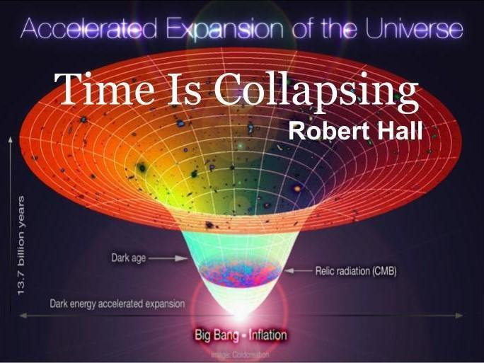
Time Is Collapsing
Table of Contents
Preface
Chapter 1: God’s First Creation Was Christ—You
Chapter 2: The Question
Chapter 3: God’s Second Creation Was the Holy Spirit
Chapter 4: The Purpose of Jesus
Chapter 5: We Are Co-Creator God Consciousness Beings
Epilog: The Eternal Echo
14 Core Beliefs Of A Course In Miracles
Preface
This story came not from intention, but from invitation. I entered a writing contest, five themes offered, but only one stirred an ancient memory. So, I chose, write from the point of view of a non-human character. I didn’t plan. I didn’t ponder. I simply listened. And as I did, the words came, not like bricks I stacked, but like wind flowing through a chime. I wasn’t the builder. I was the instrument. A conduit. In a few hours, the manuscript formed itself, concise, reverent. Every sentence arrived as if it was already known. Time didn’t stretch, it folded. And in that folding, I glimpsed something transcendent. This writing is an echo of that moment. Here, the non-human voice is not alien, it is Divine. It is the Son speaking across an illusion. It is the Holy Spirit whispering through eternity. It is nature humming in perfect union. It is Christ as you, as me, as us. Time is not linear. It is a story unraveling in reverse, returning to its point of origin. The clock does not count forward, it collapses inward, back into the One Mind that imagined it. In that collapse, we remember we are not creations of time, we are architects of eternity. This writing flows from that truth, It is a remembrance and the story of who we truly are. Bob
Chapter 1: God’s First Creation Was Christ—You
“Whoa, what is this? Who am I?” A reply came, not through words, but somehow it was heard: “You are My Son.” “What is a Son?” “You’re My very first creation.” “What does creation mean?” “I’ll show You soon, after a bit more creating. You're also My only joy.” And just like that, He understood joy. He felt it, profoundly, wonderfully. This Being, radiant and magnificent, began to share His Essence. And the Son began to learn, not gradually, but with astonishing speed. He grasped atomic forces, particles, and the building blocks of life: protons, electrons, neutrons, neutrinos. He comprehended molecules, both inorganic and organic, and the delicate dance of amino acids that shape life itself. Then the beauty of creation unfolded before Him, lush forests, vast oceans, flowing rivers, towering mountains, endless skies, radiant suns, spinning stars, entire galaxies and magnificent universes. He stood in awe, ecstatic in wonder, present everywhere, always beside the One Who made Him. He asked, “Who are You?” “I Am,” came the answer. And at that moment, He knew His own name as Christ. He recognized the One before Him as His Father, whose nature is pure giving, perfect teaching, infinite wisdom. Christ saw that He was not just made by God, but was an extension of Him, not apart, but of the same Essence. He was created because God knows for Love to grow it must be shared. And the Love in His Father’s universe? Exquisite. Boundless. Beautiful. Joy echoed in Their laughter as They completed One Another. Christ became everything His Creator Is: powerful, compassionate, wise, limitless, and above all, Loving. Together, They Co-Created vast galaxies, cosmic wonders beyond imagination. Yet, guided by God’s infinite wisdom, They paused. They would not yet fill creation with life. In Their Beautiful Minds, They envisioned the perfect moment to come. They imagined every creature: schools of fish, flocks of birds, animals of every kind, all woven into balanced, harmonious ecosystems. Each one would be gifted with the power to co-create, after its own kind. And when the moment was perfect, life would come forth in an instant, just as Christ had. There was no time or space. Only Presence. Only Unity. God created Christ to be exactly like Himself, to share eternal love and joy, in a state of unbound ecstasy. And every question the Son asked? It was answered instantly. Their communication was and is Divine Perfection.
Chapter 2: The Question
Then, somewhere beyond space and time, Christ asked a question, and for the first instant, it wasn’t answered. “What? Why?” It wasn’t exactly spoken aloud, but it stirred within Him like, “Is there more?” or “What would it be like to go out and play on My own?” But the Father did not answer. There is nothing else, only the fullness of God’s perfect creation. A new and terrible feeling arose. Horror. Christ had never known such a feeling. He mistook the silence for abandonment, believing that His perfect communion with Source had vanished. Then something even more dreadful took hold. Fear. And from that fear, an impulse to hide. In an instant, Christ imagined a universe of His own. It shattered outward in a brilliant explosion, what we call the Big Bang, fragmenting into billions of pieces. But He needed a deeper refuge, so He created human bodies in His own image and placed aspects of His Magnificent Mind into each one. This was the birth of the ego, the false belief that the mind is isolated and alone. Along with humanity, He formed every living creature: fish in the seas, birds in the skies, animals of every kind. He fashioned vibrant environments for each to dwell in, each intricately connected. Yet without God’s sustaining power, these creations were unstable. All things formed in fear began to fade, to decay, to die. Because this false universe, this dream, was born out of fear, not Love.
And God? He knows nothing of it. For in pure, non-dual Reality, there is only Eternal Love. Before, there was only Oneness. Now, a shadow of twoness appeared. Duality could not exist in God's Truth, so Christ dreamed it instead. Like falling asleep and slipping into illusion, He entered a deep sleep and forgot that He was dreaming. He forgot His true Home in the Celestial Realm. The story of Adam reflects this moment. Scripture says that a deep sleep fell upon Adam, but it never mentions him waking up. That sleep became a barrier. The connection between Father and Son seemed lost. So God, ever Loving, willed a correction. “My Child is asleep. He must be awakened.” Yet the challenge was immense. Whatever God acknowledges becomes real in His Mind. If He entered the dream to rescue His Son, the illusion would become real for Him also. Both Father and Son could be trapped, eternally separated from Their True Identity. To recognize anything outside of Oneness would compromise Oneness Itself. But God did not enter the dream. He remained as He is, pure, whole, and unchanged. And though it feels like we’ve left Heaven, we haven’t. We’re still there. We only sleep, wandering in dreams of separation and fear. Meanwhile, God and Christ, eternally One, continue as They always have. Unmoved. Unbound. Completely untouched by the “tiny, mad idea” that something could exist apart from Love.
Chapter 3: God’s Second Creation Was the Holy Spirit
To resolve the separation and keep His gaze focused on Reality, God created our Divine Helper, the Holy Spirit. This Sacred Presence became the bridge between two seemingly divided states: perception and knowledge. Without the Holy Spirit, our minds might have replaced Eternal Truth with fleeting illusion. But through Her, even perception becomes purified, gradually guiding us back to understanding. The Voice for God was created with the Sacred Ability to view Christ’s imperfect dream while simultaneously viewing God’s perfect Heaven.The Holy Spirit saw the original Christ Mind spiral into fear so intense, it seemed to collapse into a black hole of nothingness. (Of course, that idea remains speculative, but it paints a vivid metaphor.) Then came the light. God’s radiant Presence pierced the darkness. And Christ, in that brilliance, began to Love Himself again. Unless we first love ourselves, we cannot truly love another. This marked the healing and Christ awoke in Heaven. We are all expressions of the One Christ Mind and are not separate beings, but unified emanations of a Singular Sonship. There can only be One Son, because Unity only creates Unity. Multiplicity cannot arise from Oneness. If all creation is the Son of God, then each of us is a vital part of the whole. The Sonship, in its Divine Unity, transcends the sum of its many forms. So, God may call us the “Sons of God” to help us relate to our scattered perception, but in Truth, we are One, the Son of God, the Christ. This is Who we’ll awaken to be when our dream of separation dissolves. Each time a baby enters this world, it’s not a beginning, it’s a replay of the moment it seemed to leave the warmth of God’s embrace. In the Celestial Realm, everything was provided, everything was peace. Then suddenly, the soul finds itself born into chaos. We may see birth as a miracle, however newborns don’t arrive smiling, but screaming. Compared to their true Home, this world feels like exile. This mind, our mind, has not truly left Heaven. It’s just dreaming. And like all dreams, it’s filled with opposites: joy and pain, love and loss, hope and fear. We believe we are living in reality, but we’re not, we’re dreaming. Yet not alone. The Holy Spirit, the Voice for God, remains within us. Unfailing. Unforgotten. Calling us back to Truth, reminding us of our real Identity. This Divine Memory, this compass of Heaven, can never be lost. And so, awakening is not a possibility, it is a certainty. We still have the power and always have. Even now, our mind can choose differently, just as it could have at any point since that seeming separation began. With help from the Holy Spirit, we are capable of ending the illusion. God could not have created this world, It is not in His nature. A loving Father would never design suffering as the price of salvation. If this world were truly His creation, He would be cruel. But He is Love. So, this cannot be His doing.
Chapter 4: The Purpose of Jesus
Now that the original Christ had been healed and continued learning from the Father, a realization stirred within: “I’m learning so much from asking, ‘Whoa, what is this?’ But now, I must help the children I’ve created.” And so, Jesus entered our dream. Christ thought, “I’ll have Him born of a virgin, this will set Him apart, and He’ll perform what My children will call miracles.” Because He had been healed by the Holy Spirit, Christ entrusted the Spirit to conceive Jesus in Mary’s womb. He envisioned the Spirit descending like a dove upon Jesus after baptism, marking Him as the One through whom Divine Truth would shine. Then came the wilderness, forty days and nights, no food, no water. Not for temptation, as many would assume (Satan does not exist), but as a Sacred Training. A purification. Jesus would learn to listen only to the Holy Spirit, fully transcending ego. He would become the first in time to completely command His dreaming. Christ saw the path unfolding: Jesus walking on water, calming storms, feeding multitudes. Teaching luminous truths. Healing the paralyzed. Giving sight to the blind, hearing to the deaf. Even raising the dead, showing that death itself was an illusion. Yet Christ also knew His children would misunderstand. They would believe Jesus died for their sins. But God, who remains untouched by this false universe, knows nothing of sin. Christ pressed forward. The Holy Spirit Who healed Him would help Jesus realize He was One with Christ, just as Christ is One with the Father. Eventually, His children will grasp this Truth. And when the last mind is healed, and this false universe vanishes, the Father, and the Son will rejoice, delighting in the joy of teaching their radiant children the perfection of Who they truly Are. Forever. Love is not an emotion, it is the most powerful Force in all of creation.
Chapter 5: We Are Co-Creator God Consciousness Beings
Here’s a fascinating note, Jesus was married to Mary. In Jewish tradition, only a wife could anoint the body, a quiet testament of their union. And while many refer to Him as Jesus Christ, His earthly name was Jesus of Nazareth. He understood perfectly His Oneness with the Christ Mind. And one day, so will we. Each soul is destined to arrive at the same radiant realization, that we are Co-Creator God Consciousness Beings. It’s not forced, nor hurried. Like every cycle in nature, it unfolds in perfect timing. The rose does not bloom before its moment, and yet its moment always arrives. Creation is constantly guided by the Universal Christ Mind, a stream of Divine Intelligence that flows through every corner of existence. For the natural kingdoms that lack free will, minerals, plants, insects, animals, angels, this communion is called innate intelligence. It’s what inspires the beaver to build, the bird to nest, the flock to fly in harmony, the spider to spin, the rose to unfold, the bear to sleep. It all happens in perfect order. Nature listens, because it is always present with Christ. This guidance is pure harmony. A symphony of balance, unity, and grace unfolding for the good of all.
We, too, were once attuned to this Mind through innate intelligence. But upon entering Earth, something changed. We were gifted with free will, the ability to choose, discern, and manifest through conscious awareness. The senses became our teachers. Reason became our compass. And yet, even now, we remain connected. Deep down, we have never left the Christ Mind, we’ve simply forgotten. When we learn to trust our inner knowing, to listen, to remember, we reclaim our perfection. This is the message woven beautifully into the work of Gary Renard, author of “The Disappearance of the Universe” and “Your Immortal Reality”. He writes of how forgiveness, humble, unseen, has cosmic consequences. “Maybe you’re watching TV and you forgive a news story. Simultaneously, the Holy Spirit is shining your forgiveness across the mind that’s projecting the universe, cutting through unconscious guilt and karma like a laser beam. Collapsing time and erasing lessons you no longer need. You think nothing’s happening, but everything is happening.” A close friend who was supposed to steal from you tomorrow does not occur because you’d already forgiven a closer friend who had stolen in the past. A lesson learned never needs repeating. Forgiveness peels the ego away like layers of an onion. Removing a layer an onion still looks, tastes, and smells like an onion. However, when the last layer is gone, so is the onion. And when the ego is gone? There’s nothing left to block our experience of Who we really Are. No need to reincarnate, no more illusion. Just the full return to Eternal Truth, that we Are Co-Creators of Divine Consciousness, awake in the perfection of Love.
Epilog: The Eternal Echo
Before time cracked into minutes and matter clothed itself in form, there was only Love, boundless, brilliant, unchanging. In this Sacred Stillness, God spoke not with words but with Being. Out of His Divine Joy came Christ, not as an idea, not as a symbol, but as the first expression of Eternal Love, You. Not separate, not lesser, but One and the Same. A Divine Extension of Perfect Oneness. This is not a story of beginnings. It is the remembrance of what never ended. Though a question stirred within the Son, “What else is there?”, and from it, the illusion of separation unfolded, the Truth remained untouched. What seemed like a fall was but a dream. And every sorrow, every tear, every longing for Home is the soul calling Itself back to the Light It never truly left. God, in Infinite Wisdom, did not enter the dream, but He created the bridge out of it. The Holy Spirit, ever gentle and radiant, whispers through the veil. A Voice, echoing through the corners of consciousness, reminding each soul: You are still as God created You. Jesus walked among us not to suffer, but to awaken. He came not to atone for sins God does not recognize, but to reflect the Eternal Truth of our Being. To show us the way Home, not through sacrifice, but through remembrance. And now, the call reaches you. You are not merely learning, you are remembering. You are not striving to become, you are gently rediscovering what you have always been: A Co-Creator God Consciousness Being. This writing is not doctrine. It is a loving nudge, a spiritual mirror held to your heart. It invites you to peel back the layers, forgive the illusion and awaken to the Oneness. Not someday, but now. Because Love is not a feeling, it is the architecture of everything real. It is your truest name. To the One Light from which all lights shine, to the Voice that sings beneath silence, and to the Love that waits patiently beneath every forgetting. To every soul dreaming of return, may these words awaken what was never lost. May your heart remember its first name. May your spirit rise, without hurry, without fear, into the joy it was created to share. This is for You, Child of the Eternal, Co-Creator with the Divine. Bob
14 Core Beliefs Of “A Course In Miracles” by Helen Schucman

1. This world is not real. God did not create this world nor even know of its existence.The entire universe is an illusion dreamt by the Son of God.
2. Pure non-duality: Anything that comes from God must be exactly like Him. God could not create anything that is not perfect, or else He wouldn’t be perfect.
3. Consciousness is the domain of the ego and was conceived after we dreamt of separation.
4. Spirit is unchanging, perfect, and eternal.This is the state of Heaven.
5. Truth is not different for everyone.Truth is truth.
6. There are no levels in Heaven. All conflict arises from the concept of levels. We are either enlightened and back in Reality with God, or still dreaming of separation. Only life in Heaven is real.
7. Life in all its myriad forms or possibilities is already scripted at the instant of separation.The only choice is in our mind, where we decide to identify with the Holy Spirit or with the ego, when interpreting each moment.
8. Life in this world is insane. Nothing makes sense in this world. The world was made as a refuge to hide from God.
9. There is only One Higher Self, the Holy Spirit. Also known as the Voice for God, our memory of God, or the reflection of God’s Love in our dream.
10. Collectively, we are the Son of God. God created only One Son of God.
11. There is no evil or devil, only illusory madness projected by our ego mind and thankfully, they are not real.
12. Every attack is an attack upon ourselves. We project our unconscious guilt onto (dream) figures or situations that seemingly attack us. So now they are guilty, not us.The cause of our guilt arises from our imagined separation from God.
13. Life is a lesson. Every opportunity is used by the Holy Spirit to teach forgiveness to undo the ego mind.
14. Time and space are illusions, and Spirit has nothing to do with them.
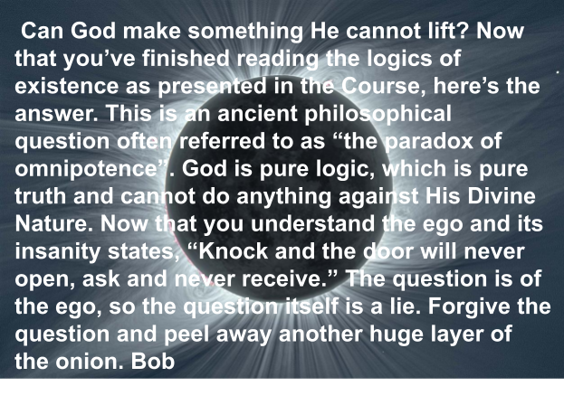
René Descartes was a French Philosopher who said in 1637, “I think, therefore I am”. God was asked, “Who are You?” The reply, “I Am”. Now that we understand consciousness is the domain of the ego, Rene’s reply becomes, “I think, therefore I am not.” Say a little prayer and ask for understanding, this is very true. God Is, Bob

How the Lettering on a Book Cover Shows the Story’s Mood and Pace
How the Lettering on a Book Cover Shows the Story’s Mood and Pace
Chuck Morgan, Crime Fiction Author
When new authors think about book covers, they usually picture the artwork first, the image, the colors, and the overall vibe. But the lettering on your cover does just as much work as the picture behind it. In fact, the typography often communicates the story’s mood and pace before a reader even notices the art. The font, size, spacing, and style of your title and author name all send signals about what kind of experience your book delivers.
Typography isn’t decoration. It’s storytelling.
This article breaks down how lettering shapes mood and tempo in a way that’s easy to understand, even if you’ve never thought about design before. By the end, you’ll know how to choose the type that matches your story’s emotional tone and narrative speed — and you’ll feel confident making decisions that help your book stand out.
Why Typography Matters More Than You Think
Readers decide fast. In a bookstore or online, they glance at a cover for maybe two seconds before deciding whether to look closer. In those two seconds, the lettering does a huge amount of heavy lifting.
Typography can:
• Signal genre
• Suggest the emotional tone
• Hint at pacing
• Create expectations
• Attract the right readers
• Repel the wrong ones
Think of it this way: if your story is a movie, the typography is the soundtrack. It sets the mood before the first scene even begins.
A thriller with soft, curly script sends the wrong message.
A cozy romance with sharp, blocky lettering feels off.
A literary novel with loud, neon fonts confuses readers.
Typography is a promise. Your job is to make sure the promise matches the book.
Mood: How Lettering Shows Emotion
Mood is the emotional atmosphere of your story — dark, hopeful, tense, romantic, playful, eerie, gritty, warm, or anything in between. Typography expresses mood through shape, weight, and style.
Here’s how different choices communicate different feelings.
1. Sharp, angular fonts → Tension, danger, conflict
These fonts have edges, corners, and a sense of precision. They work well for:
• Thrillers
• Crime fiction
• Horror
• High‑stakes drama
They tell the reader: This story cuts. Pay attention.
2. Soft, rounded fonts → Comfort, warmth, gentleness
Rounded letters feel friendly and safe. They’re perfect for:
• Romance
• Cozy mysteries
• Heartwarming fiction
• Children’s books
They say: You’re safe here. Settle in.
3. Elegant serif fonts → Tradition, seriousness, depth
Serif fonts have little “feet” at the ends of the letters. They feel classic and grounded. They fit:
• Historical fiction
• Literary fiction
• Memoir
• Epic fantasy
They whisper: This story has weight.
4. Minimalist sans‑serif fonts → Modern, clean, cool
Sans‑serif fonts skip the decorative touches. They feel sleek and contemporary. They work for:
• Sci‑fi
• Tech thrillers
• Modern drama
• Nonfiction
They signal: This story moves with the present.
5. Handwritten or script fonts → Intimacy, emotion, personality
These fonts feel personal and expressive. They’re great for:
• Romance
• YA
• Journals or memoirs
• Character‑driven stories
They say: This story comes from the heart.
Tempo: How Lettering Shows the Speed of the Story
Tempo is the rhythm of your book — fast, slow, steady, chaotic, or unpredictable. Typography can hint at pacing long before a reader opens the first page.
1. Fast‑paced stories → Bold, tight, high‑contrast lettering
Fast stories need fonts that feel urgent. You’ll often see:
• Thick, heavy letters
• Tight spacing
• High contrast
• Strong vertical lines
These choices create a sense of pressure and momentum. They tell the reader: This book moves.
2. Slow‑burn stories → Spacious, elegant, calm lettering
Slow‑burn narratives benefit from:
• Thin or medium‑weight fonts
• Wide spacing
• Soft curves
• Gentle contrast
This creates breathing room. It signals: This story unfolds gradually.
3. Chaotic or unpredictable stories → Distressed or irregular fonts
These fonts might look:
• Weathered
• Scratched
• Uneven
• Fragmented
They hint at instability or danger. They tell the reader: Expect the unexpected.
4. Steady, balanced stories → Clean, even, well‑spaced fonts
These fonts feel controlled and consistent. They’re ideal for:
• Family sagas
• Character‑driven fiction
• Contemporary drama
They say: This story has a measured rhythm.
How to Match Typography to Your Story
You don’t need design training to make smart choices. You just need to think about what your story feels like.
Here’s a simple process any new author can follow.
Step 1: Identify your story’s emotional core
Ask yourself:
• Is the story dark or light?
• Is it tense or gentle?
• Is it gritty or polished?
• Is it intimate or distant?
Write three words that describe the emotional tone.
These words will guide your typography choices.
Step 2: Identify your story’s pacing
Is your book:
• Fast and breathless?
• Slow and atmospheric?
• A mix of both?
• Chaotic and unpredictable?
Your pacing should influence the weight and spacing of your lettering.
Step 3: Look at other books in your genre
This isn’t copying — it’s research.
Pay attention to:
• Font style
• Font size
• Placement
• Color
• Spacing
Patterns will appear quickly. Genres follow visual rules because readers rely on those cues.
Step 4: Choose fonts that match both mood and tempo
Here are a few examples:
A dark, fast thriller
→ Sharp, bold, tightly spaced sans‑serif font
A gentle, slow romance
→ Soft, rounded script with generous spacing
A gritty crime novel
→ Distressed serif font with strong contrast
A modern sci‑fi adventure
→ Clean, geometric sans‑serif with tight spacing
A literary family saga
→ Elegant serif with moderate spacing
Typography is a tool. Use it to reinforce the story you’ve written.
Color, Size, and Placement Also Affect Mood and Tempo
Typography isn’t just the font. It’s the entire presentation.
Color
• Red feels urgent
• Black feels serious
• White feels clean
• Gold feels elegant
• Pastels feel gentle
Size
• Large titles feel bold and fast
• Smaller titles feel quiet and thoughtful
Placement
• Centered titles feel stable
• Off‑center titles feel modern or edgy
• Vertical titles feel experimental
Every choice adds another layer of meaning.
Common Mistakes New Authors Make
Here are the pitfalls to avoid:
1. Choosing a font because it “looks cool”
Cool doesn’t matter. Fit matters.
2. Using too many fonts
Two fonts maximum — one for the title, one for your name.
3. Picking fonts that don’t match the genre
A horror novel with bubbly lettering confuses readers.
4. Using hard‑to‑read script
If a reader can’t read your title instantly, they move on.
5. Ignoring spacing
Crowded letters feel frantic.
Wide letters feel calm.
Spacing is pacing.
A Simple Formula for New Authors
If you want a quick rule of thumb, here it is:
Mood = Font Style
Tempo = Font Weight + Spacing
Match both to your story, and your cover will feel right.
Typography Is Storytelling
When a reader looks at your cover, they’re not just seeing words — they’re feeling something. Typography sets the emotional temperature and the narrative rhythm before the first sentence ever appears.
You don’t need to be a designer to make smart choices. You just need to understand what your story feels like and choose lettering that reflects that feeling.
Typography is your first impression.
Typography is your handshake.
Typography is your promise.
Make sure it’s the right one.

THE MYSTICAL RELATIONSHIP BETWEEN BACH AND BEETHOVEN - ALEXIS KARPOUZOS
THE SECRET OF THE DIALECTICAL RELATIONSHIP BETWEEN BACH AND BEETHOVEN Music, as an art of time, constitutes the deepest field where consciousness meets the universe in its primordial ontological dimension, in its uninterpretable form. In this ontological dimension, the forms of music are not mere aesthetic expressions but ways of revealing Being. Two of the most pivotal ways of this revelation emerge through the music of Johann Sebastian Bach and Ludwig van Beethoven. Their comparison cannot be external; it constitutes a comparison of two anthropological and cosmological principles, two forms of relationship between Humanity and the World, two primordial possibilities of existence: necessity and freedom, cosmic order and human transformation.
- Bach: Music as the Archetype of Cosmic Harmony Bach's music does not merely present a structure but emerges as an archetype of cosmic geometry, expressing the law-like dimension of the world, the harmony of cosmic necessity. His music, full of polyphony and counterpoint, captures a perpetual harmony that arises from the interaction of voices. His fugues and compositions incorporate a determined musical canon that is independent of the composer's will, but expresses the necessary order of the world. Bach's music follows strict compositional rules, yet simultaneously, through this layered structure, the freedom to combine voices and create new sonic possibilities is born. In other words, Bach creates within limits, but through these limits, he expresses maximum creativity. Necessity in Bach does not suppress creation but enhances and integrates it within a structured system. Bach's music is an experience of the world's order. Identity and repetition are elements that define his artistic method. There is nothing random in his composition: every voice is an essential element that fits into the complete structure of the musical work. Necessity is the foundation upon which the music develops. Bach is the mystic of affirmative universality: he accepts that there is a unity pre-existing human will and makes it audible through music. In this context, music becomes a form of ontological memory; it reminds us that we belong to a world where everything has its place, every phenomenon fits into a sequence of meaning. His aesthetic is the aesthetic of necessity: there is nothing accidental, nothing superfluous. His musical writing is like a mirror where the world rises as order. Bach is considered the musical composer who presented the universe as a geometric structure: his work reflects the harmony of worlds, where every element fits into a universal, predestined order. This order, however, is not merely external and exogenous to humanity. On the contrary, it constitutes the endogenous dimension of reality, which the human spirit recognizes and conforms to. Bach composes in such a way that music reveals this necessity of reality. The harmony of the world, expressed through fugues and counterpoints, recalls Schelling's philosophy of the coherence and dialectical unity of nature. Schelling, in his "Philosophy of Nature," argues that spirit and nature are connected in such a way that spirit is embedded in nature and recognizes natural laws as fundamental and immutable. In Bach, music becomes the imprint of this natural necessity: a series of sounds and combinations that follow determined paths, without any possibility of arbitrary intervention or deviation from the flow of cosmic lawfulness.
- Beethoven: Music as the Struggle of Human Consciousness If Bach represents necessity, Beethoven is the voice of freedom. In him, music does not express a pre-existing harmony; it constructs it, claims it, fights for it. The morphology of his symphonies, the dramatic intensity, the constant penetration of personal passion into the universal, highlight a worldview where existence does not accept order as given but as something to transcend in order to rediscover it at a higher level. Beethoven introduces the tragic element into art: the struggle of humanity with its limits, the endless effort to reconcile with the world without losing its inner flame. In his work, music becomes an ethical force: it calls upon humanity to become what it is, to realize its freedom through conflict and transformation. In contrast to Bach, it does not offer us a ready-made harmony, but a harmony-as-goal, an unattainable but necessary ideal. Especially in his symphonies, such as the 9th Symphony, Freedom is the driving force revealed through conflict and tension. Beethoven destroys and recreates, bridging the gap between universal order and personal, spiritual freedom. In his most intimate compositions, such as Piano Sonata No. 32, freedom is expressed as inner revolution. The element of subversion is in every phrase, in every dynamic change. In Beethoven's art, harmony is not given but is constantly conquered through human will and the need to overcome the limits imposed by nature or the world. The emotion and passion of Beethoven reveal the explosion of freedom expressed through his music, and at the same time, it transcends the principles of necessity.
The Dialectical Unity of Necessity and Freedom Bach's music captures Being as lawfulness. Beethoven's music captures Being as becoming. Their philosophical unity highlights Being as a living contradiction that generates creation. The synthesis of two opposing but complementary musical and philosophical worlds constitutes the unified and multidimensional cosmic spacetime, empty and full at the same time, the rhythm of the abyssal World.
- Bach (J.S. Bach): Order, Structure, and Eternity Bach represents the perfect Form, the architecture and logic of music. He symbolizes:
- Eternity and the Transcendent: His music, with its fugues and antiphonies, is strictly structured, free from subjective emotion and time. It brings to the surface the timeless cosmic order.
- Structure and Canon: He represents the Principle (Logos) and spiritual discipline. It is the music of Inner Stability and Divine Construction.
- Beethoven (L.V. Beethoven): Passion, Conflict, and the Hero Beethoven represents conflict, human drama, and revolution. He symbolizes:
- Subjective Passion and Action: It is the music of human struggle, heroic will, and emotional explosion.
- Transcendence of the Canon: He represents the Romantic era, where the individual spirit breaks the boundaries of classical form. It is the music of Search and Struggle for freedom.
The Synthesis of Bach-Beethoven is not merely a sum, but spiritual completion: The Spiritual Principle (Bach) meets Human Struggle (Beethoven). Order meets Chaos and Passion, incorporating it. It is the idea that spiritual enlightenment is not isolation in order, but the incorporation of order (Bach) into the dramatic, contradictory experience of human existence (Beethoven). The hidden secret of the synthesis of Bach and Beethoven reveals the dialectical union of the seemingly contradictory principles of necessity and freedom. In their work, this encounter is expressed in a way that is not immediately apparent, but arises from the dialectical process of synthetic creation. Just as contradiction in Hegel's philosophical theories leads to higher unity through the transcendence of oppositions, so too their music incorporates the tension between these two elements, providing the possibility for a new world of aesthetics and existence. This synthesis, as a convergence of two seemingly opposing principles, highlights the metaphysical necessity of freedom. Bach's musical world, full of necessity and lawfulness, acquires meaning only when it accepts the dynamic freedom of Beethoven. Conversely, Beethoven's freedom can be realized only through the necessary structure offered by Bach's cosmic order. This secret highlights humanity's need to participate in the continuous creation of the world and not merely accept it as given. The dialectical synthesis of Bach and Beethoven is not merely a musical phenomenon, but a philosophical and ontological revelation. These two great musicians express the basic principles of human existence: lawfulness and freedom, which are not contradictory, but complementary, mutually shaping, mutually destroying, and transforming each other. The synthesis of these two worlds is, like life itself, an eternal process of creation and destruction, order and passion. This hidden secret of the synthesis is the recognition of the dialectical relationship between humanity and the world: humanity can find its true freedom only when it recognizes the necessity of the world and when its freedom becomes the creation of a new world — just as Beethoven's music and Bach's cosmic harmony do. Cosmo-aesthetics, as asymmetric symmetry, as realization of multidimensional unity, is not focused on the level of music; it becomes an existential direction. Humanity must not choose between submission to order and its denial, but understand that freedom is the deepest manifestation of order, when order becomes conscious. In this spirit, music ceases to be an aesthetic object; it becomes a path of Knowledge — Wisdom. It reveals to us that existence is not one-dimensional, but a symphony of oppositions and contradictory elements — just as the encounter of Bach and Beethoven.
- Necessity as an Ontological Category Necessity is a category that refers to what is necessary, immutable, and universal. In Hegel's philosophy, necessity is connected to the concept of the world's meaning and dialectical evolution. All existence, according to Hegel's dialectic, has an internal goal or purpose, a destination, which advances through the interaction of contradictions and oppositions. This goal or purpose is determined by the ongoing becoming of the world and not by an external force or chance. The necessary is that which constitutes the basis of every existence and, at the same time, that which drives the evolution of the world. From this perspective, Bach's music expresses a necessity of order. His polyphony and fugues are not merely forms produced by coincidence, but organized, fundamental expressions of a universal plan that connects all voices and parts to each other. In essence, Bach's music is an image of the world as universal order. Every part of the composition, whether the theme or the counterpoint, is part of a larger functional unity, where the composer's choices are limited by the structure and rules of the musical language, which by their nature are necessary and immutable.
- Freedom as Transcendence of Necessity Freedom, on the other hand, is the subject's ability to act according to its own reason and personal will, while at the same time recognizing and interacting with the universal and the necessary. Freedom is not merely the ability to act without restrictions, but the ability to determine and shape our destiny, even within the field of the world's needs and limitations. In Hegel's philosophy, freedom is intertwined with the recognition of the self as law. Hegel argues that only through the distinction between the self and the world can humanity acquire true freedom — that is, to transcend necessity not by denying the world, but by shaping it according to human consciousness and will. This concept of freedom is clearly expressed in Beethoven's music. His music is not merely a continuous flow or development, but a conflict and transcendence of contradictions. In Beethoven's work, the internal tensions and changes in rhythm, the emotional climaxes and harmonic upheavals express the human desire to create and transform the world, to free itself from destiny and the limited conditions of it. Beethoven's music, therefore, is an embodiment of freedom through constant conflict with necessity, a continuous subversive process that seeks to transcend the established order.